Case Study · 04
RSS Chemicals
A research‑driven mobile redesign of how lab managers and researchers track hazardous chemicals — search, scan, and container workflows rebuilt around the way the work actually happens at the bench.
Context
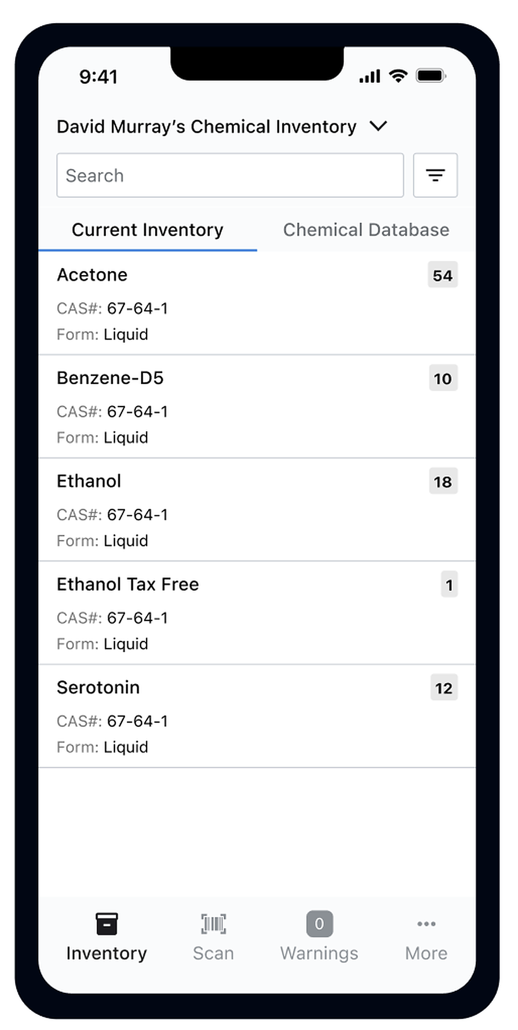
Risk and Safety Solutions builds the software that universities, healthcare systems, and research institutions use to run their safety and compliance programs. RSS Chemicals is the mobile app that runs underneath one of those programs — the tracking of hazardous chemicals across labs, stockrooms, and research facilities.
The people using it are lab managers and researchers, usually standing at a bench or walking a stockroom, often in PPE, often with one hand on a container. The app is the link between the chemical in front of them and the institution’s record of where every regulated substance lives, how much is on hand, and what its hazards are.
The problem
The existing app worked, but slowly. Search returned the wrong things. Scanning was buried in a side menu. Container information was tangled in with chemical information, which meant simple tasks — like finding the bottle on shelf B2 or adding a new container of acetone — took more taps and more guessing than they should have.
The cost wasn’t cosmetic. Bad inventory data is a compliance problem and a safety problem — missed expirations, ghost stock, hazards no one can locate. Every friction point in the app pushed users toward shortcuts that undermined the record the institution was depending on.
Discovery
I ran the research alongside the design. Interviews and shadowing sessions with lab managers, researchers, and compliance officers — people doing the actual chemical tracking, the actual audits, the actual reorders. The goal was to see how the app fit (or didn’t) into how lab work really happens, not how we’d imagined it would.
Four problems showed up across nearly every session:
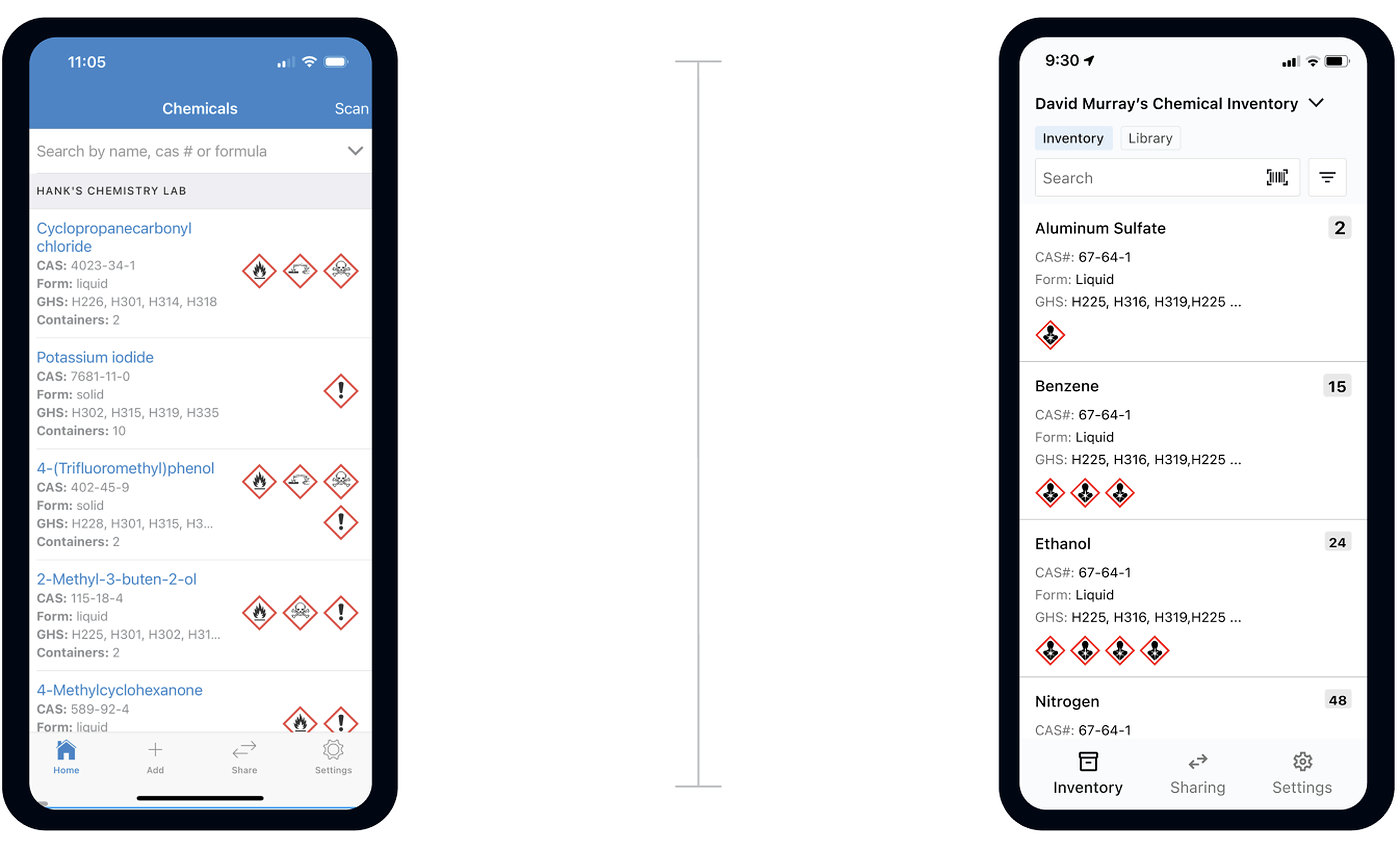
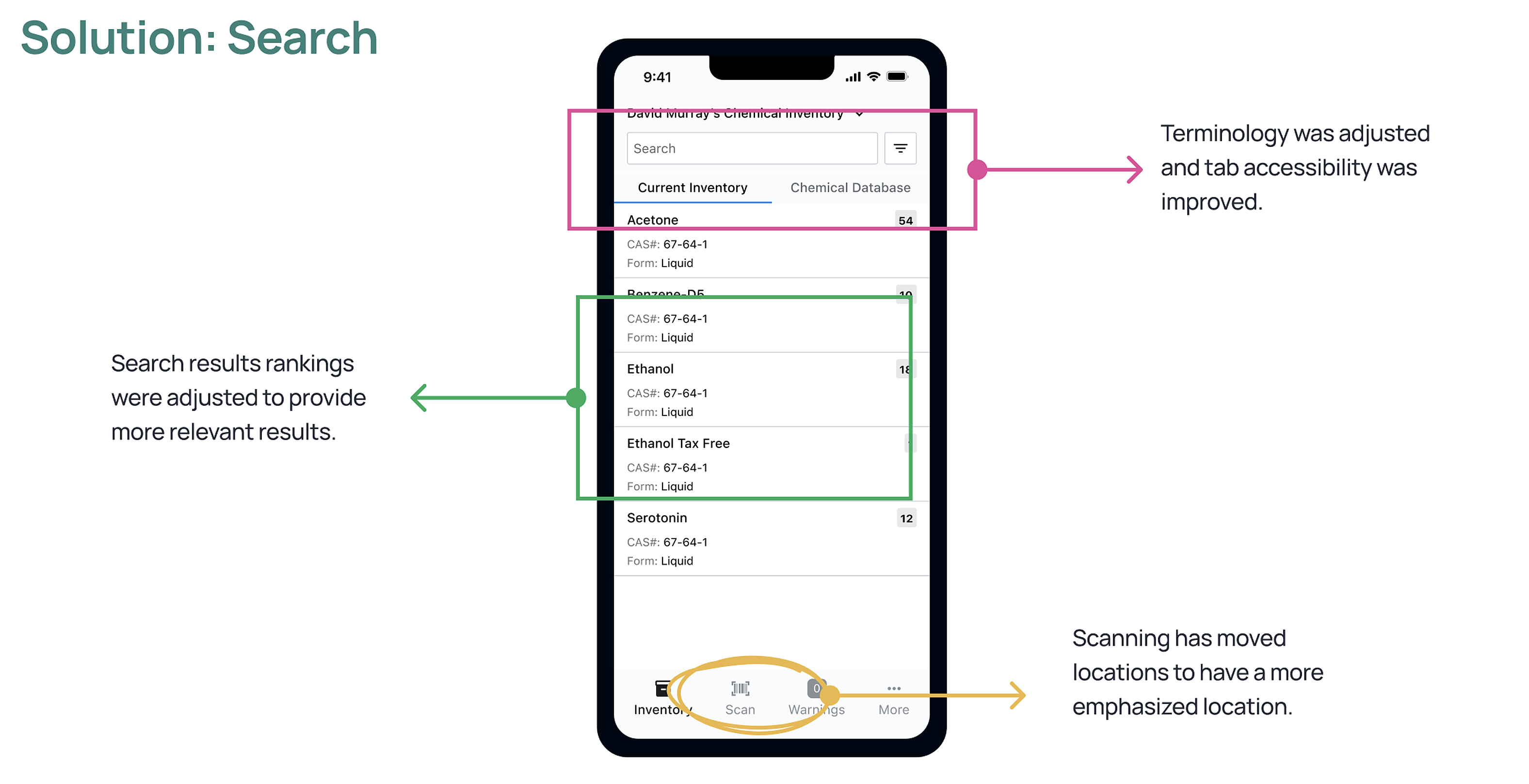
- Search returned the wrong things. Ranking didn’t reflect what users were actually looking for. A search for “ethanol” would bury the researcher’s own stock under unrelated database entries.
- Scanning was hidden. The fastest way to find or add a container is to scan its barcode. The scanner lived behind a secondary menu, which made the fast path the slow one.
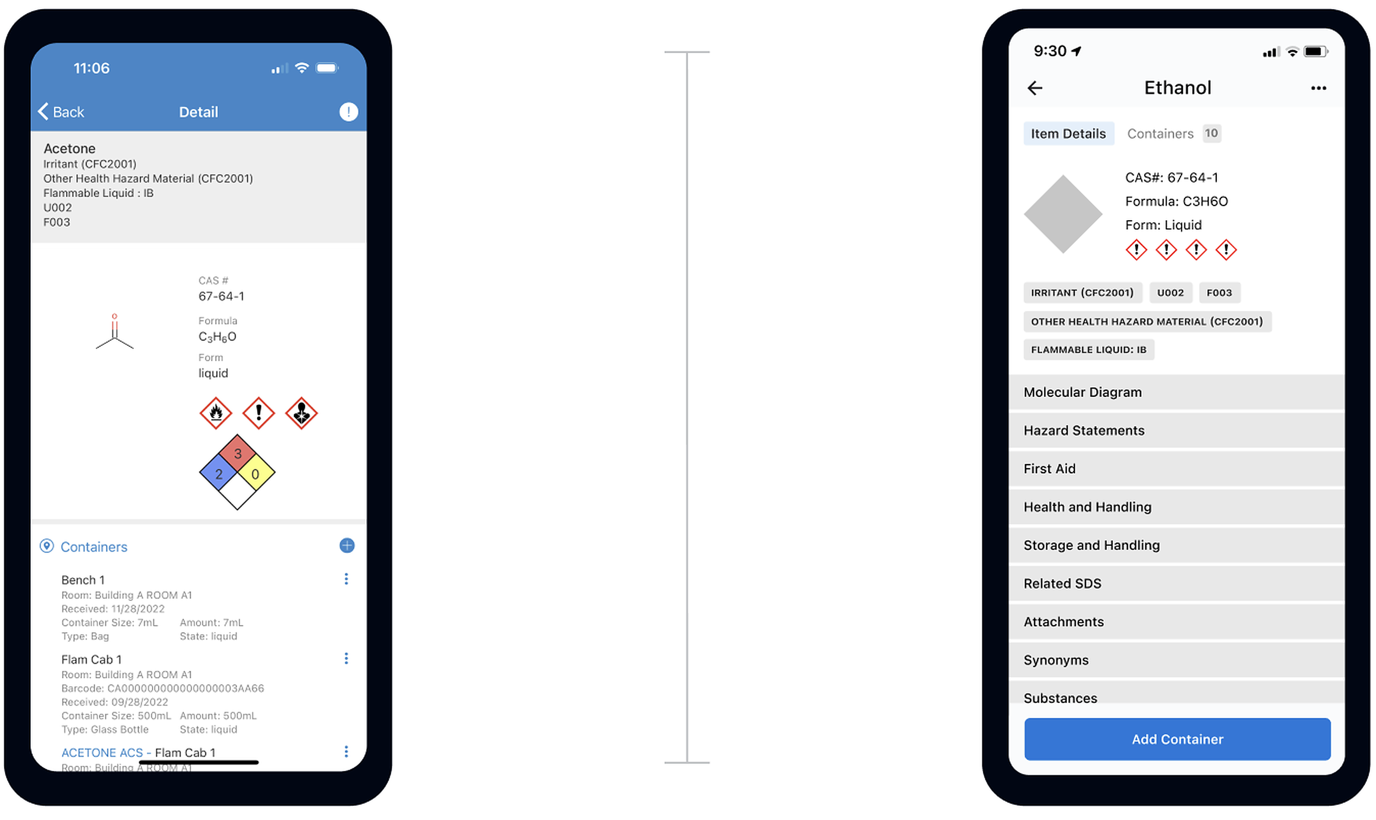
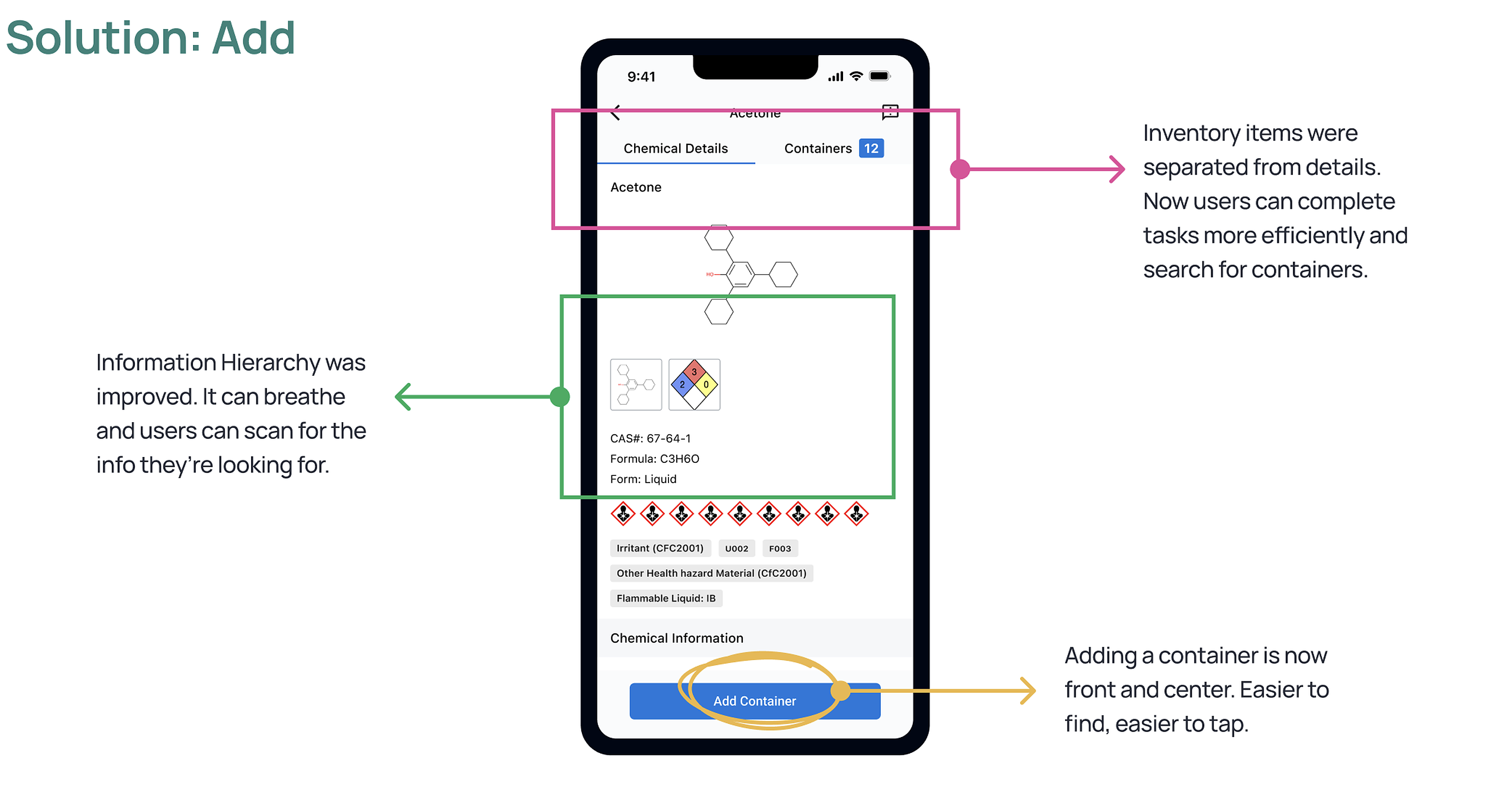
- Containers and chemicals were tangled together. A single chemical can have many containers in many rooms. The old details page mixed both into one dense list, so users had to scan past chemical metadata to get to the bottle they were looking for.
- Adding a container was hard to find. The most frequent write action in the app was buried — people would describe the workflow and then trail off, unsure where to start.
The redesign
Three areas of the app got the most attention — search, add, and scan. Each one shipped through old‑vs‑new comparisons in usability testing rounds, and each one drove a specific design move.
Search
Add & details
Scan
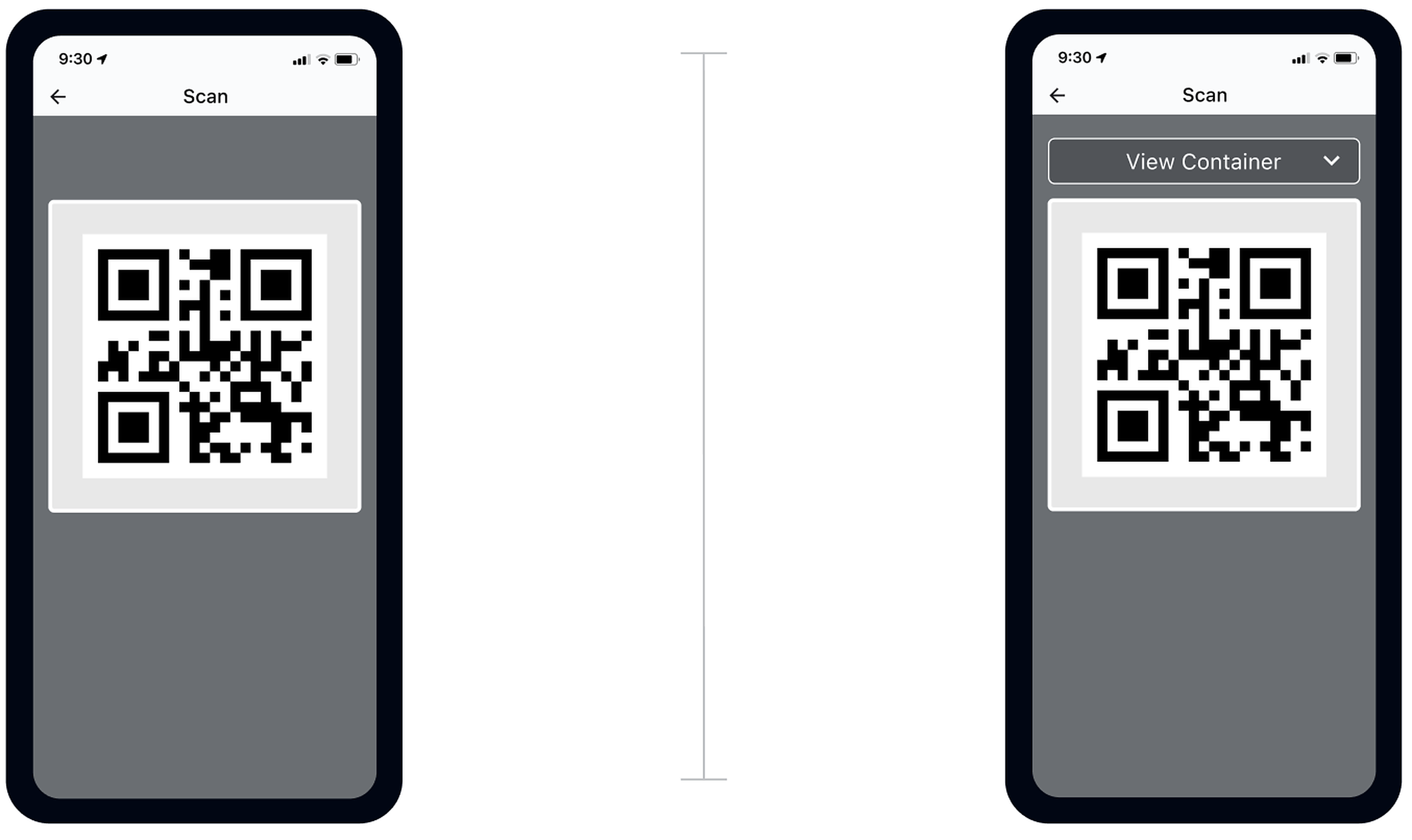
“That’s new [multi‑scan], that’s pretty cool… that actually makes it a lot easier to add a chemical.” — Lab member, usability testing
Where it stands
The redesign moved through multiple rounds of usability testing with lab managers and researchers. The findings shaped the search ranking, the details‑page split, the scanning flow, and the Add Container surfacing. Each iteration was tested against the version it was replacing.
This case study reflects the design work and the testing‑round outcomes — not field metrics from external deployment.
What I took from it
Mobile work for the lab bench has a very narrow tolerance for friction. A user wearing gloves, with one hand on a container, will not tap through a three‑step menu to scan a barcode — they’ll write the stock change on a sticky note and update the system later, if at all. Every extra tap turns into a data‑integrity problem upstream.
The other lesson was about doing research and design in the same loop. The four problems above weren’t hypotheses we’d invented — they came directly out of watching people use the old app. The redesign worked because the testing rounds were tight: change something, put it in front of a real lab user the same week, watch where they got stuck, change it again.